

Summary
Production-ready artwork means the right file for the decoration method: vector (AI, EPS, or vector PDF) for screen printing, a DST stitch file for embroidery, and a high-resolution raster at final print size for sublimation. Converting your existing logo into those formats is different from designing one, and the two shouldn’t be confused. Color is the other common surprise: inks and dyes can be mixed to a Pantone reference, but embroidery thread can’t, so it’s chosen from a stock chart as the nearest match. Specify placement as a measurement down from the high point of the shoulder (HPS) so a logo lands in the same place on every garment.
The Logo That Looked Perfect on Screen
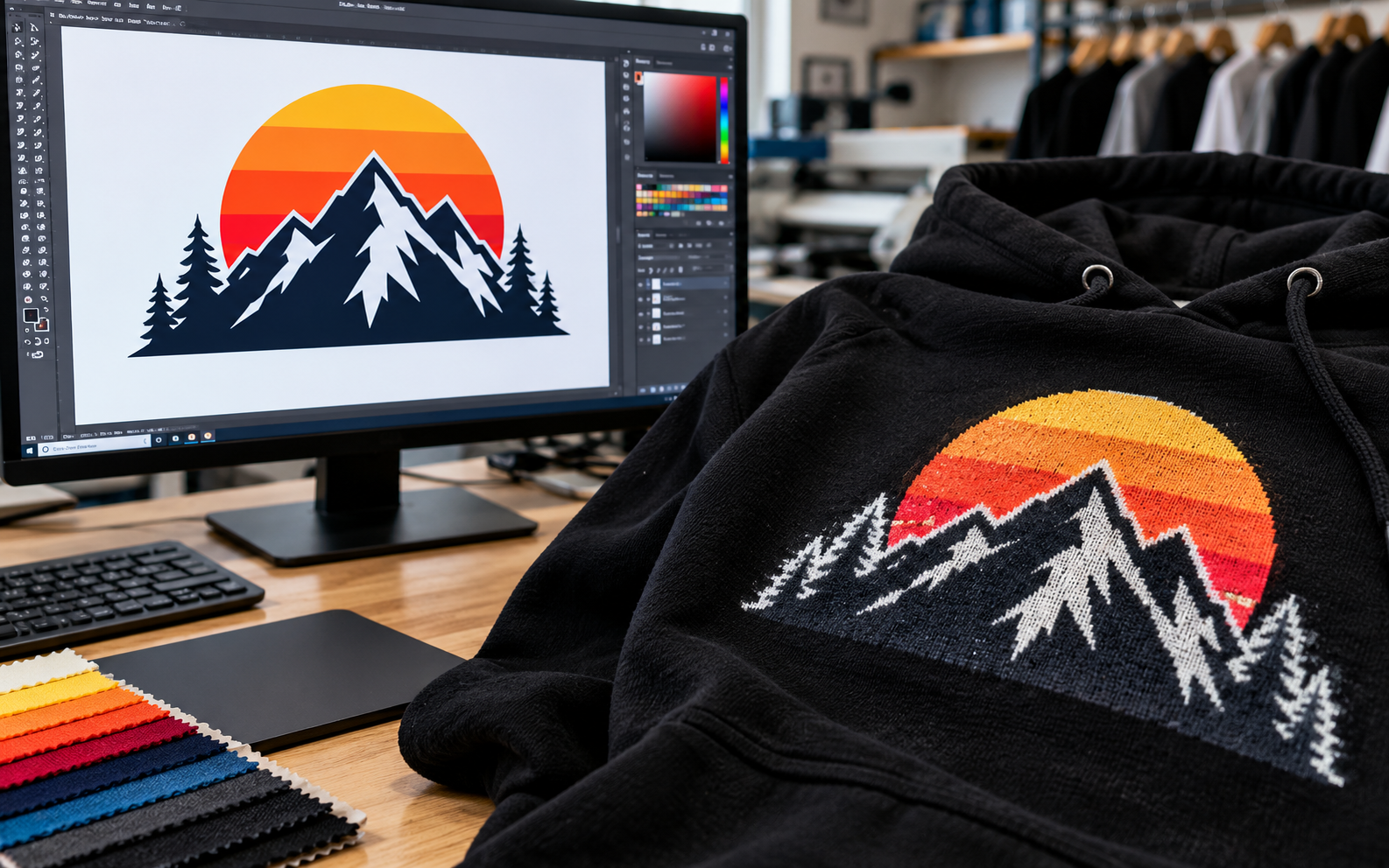
A founder sends over their logo as a PNG saved from a website. It looks crisp on their laptop. Two weeks later, the first printed hoodie arrives with soft, slightly jagged edges around the lettering. Or the embroidered cap comes back with a green that’s close to the brand color but noticeably not the same one.
Neither of these is a sloppy factory. Both are the result of the same quiet gap: the file that looks right on a screen and the file a machine actually needs are different things, and the color on a screen and the color on fabric are different things too.
This guide closes that gap. It covers which file each decoration method requires, what “conversion” really involves and where it stops, why embroidery thread can’t be color-matched the way ink can, and how to specify placement so a logo sits in the same spot across an entire run. None of it needs design skills. It just needs knowing what to send and what to expect back.
Raster vs Vector: The Distinction That Explains Most Problems
Every image file falls into one of two families.
Raster images (PNG, JPG, GIF) are built from a grid of pixels. They look sharp at the size they were made and blur or pixelate when enlarged, because the software has to invent pixels that were never there. DPI (dots per inch) describes how densely those pixels are packed. A 72 DPI image off a website is fine for a screen and far too coarse for fabric.
Vector images (AI, EPS, or a PDF saved with vector content) are built from mathematical paths and curves rather than pixels. They scale to any size, from a sleeve badge to a billboard, without losing sharpness. This is why printers and embroiderers ask for them.
The practical rule: if a design was made by drawing shapes in software like Adobe Illustrator, you probably have a vector. If it was exported from a website, a social profile, or a phone screenshot, you almost certainly have a raster, and it’s not production-ready as it stands.
A thirty-second test for whether your file is really vector
File extensions can mislead. A pixel image dropped into Illustrator and saved as an AI file is still a raster inside, and a PDF can contain nothing but a photo. The quick check is to open the file and zoom in to 400% or more. If the edges stay razor-sharp, it’s vector. If you see stair steps or blur, it isn’t, whatever the extension says.
Two other tells: a vector logo can usually be selected shape by shape, and its text can be edited or outlined. A flat image can’t. If you built the logo yourself in a design tool, go back to that original file instead of exporting a new one, because the original is almost always the vector you need.
Which File Each Method Needs
Different decoration methods read different files.
Screen printing needs vector. Each ink color is burned into its own screen, so the printer needs clean, separate shapes it can isolate by color. A vector file lets them do that precisely, with sharp edges and exact shapes. If you’re planning a run, our custom screen printing team can tell you what they need for your specific design, but a vector file in AI, EPS, or PDF format, with text converted to outlines so fonts don’t go missing, is the standard answer.
Embroidery needs a DST file. A DST isn’t an image at all. It’s a set of instructions for the embroidery machine: where each stitch goes, in what order, in which direction, and at what density. More on this below.
Sublimation needs a high-resolution raster at the final size. Sublimation prints are full-color, often photographic, artwork by transferring dye into fabric. Because it’s pixel-based, the usual guidance is 300 DPI at the size it will actually print. A small, low-resolution image enlarged to fit a chest panel will look soft, and no amount of sharpening fixes that after the fact.
Here’s the quick reference:
| Decoration method | Preferred file | Notes |
| Screen printing | Vector (AI, EPS, vector PDF) | Text outlined; colors defined |
| Embroidery | DST (digitized) | Made from your vector or clean artwork |
| Sublimation | High-res raster (about 300 DPI at final size) | Size it to the real print area. |
What “Conversion” Actually Means (and Where It Stops)
When people send a low-resolution file and are told there’s an art fee, it’s not a penalty. It’s labor. Someone has to rebuild the design properly before it can be produced.
Artwork conversion means taking a design that already exists and making it production-ready: redrawing a pixelated logo as clean vector paths, separating it into the colors a screen print needs, or digitizing it into stitches for embroidery. The design stays yours. The work is technical.
Design creation means inventing the artwork in the first place: the logo, the illustration, and the layout. That’s a creative job, and it’s a different one.
We’re deliberate about this boundary. We offer artwork conversion, but not artwork creation. If you have a design, we’ll make it production-ready. If you need one invented, a graphic designer is the right person, and it’s cheaper and quicker for everyone if that work is finished before the order starts. Knowing where the line sits also avoids a common disappointment: expecting that sending a rough sketch or a vague idea will come back as a finished design.
DST Digitising: How a Logo Becomes Stitches
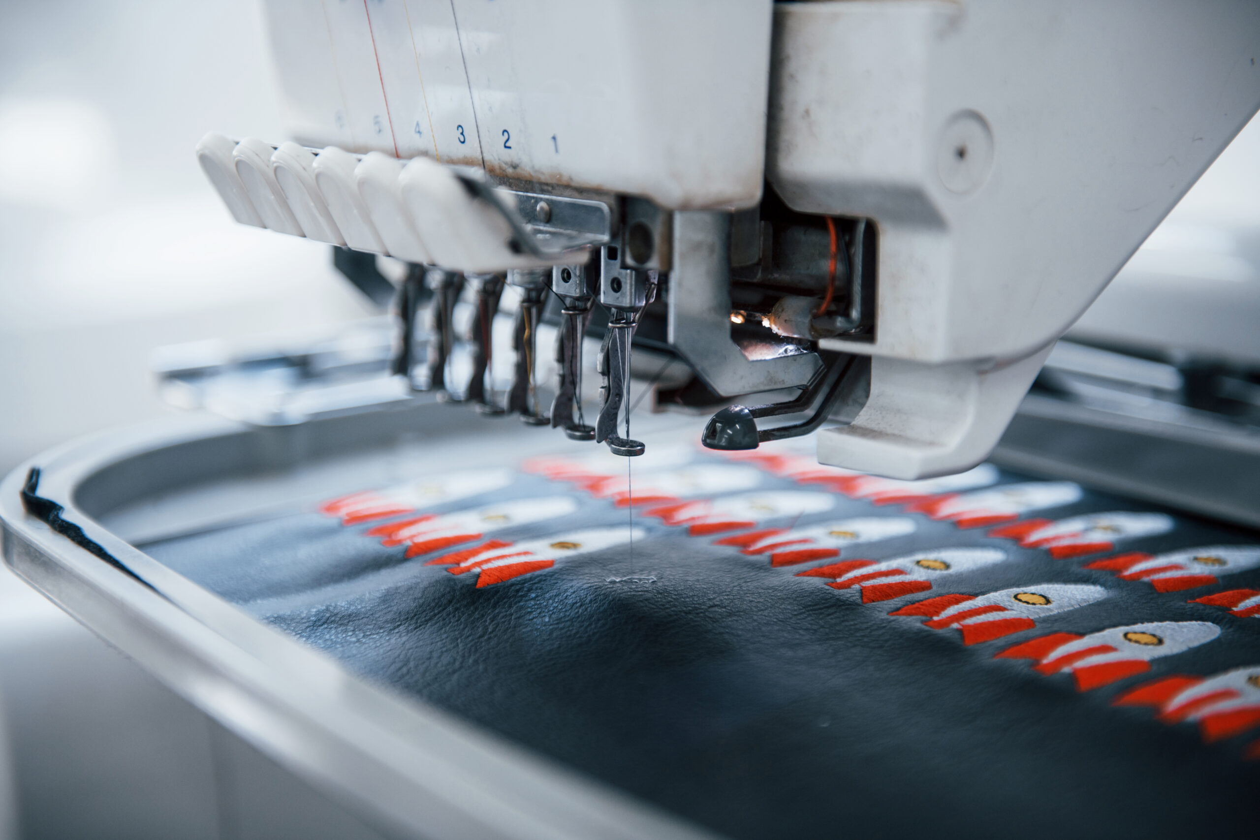
Embroidery can’t just “print” your logo. A machine has to physically lay thread, so the design has to be translated into stitch paths. That translation is called digitizing, and the result is typically a DST file, a widely used machine format.
A digitizer makes dozens of decisions that a flat image doesn’t contain: which areas are filled with stitches and which are outlined, which direction the stitches run, how dense they are, what sits underneath to stabilize the fabric, and what order the colors sew in. Good digitizing is why one embroidered logo looks crisp and another looks lumpy, even from the same artwork.
Some practical consequences:
- Fine detail doesn’t survive. Very small text and hairline lines fill in with thread. A commonly cited guideline is that lettering below about a quarter inch tall gets hard to read.
- Gradients and photographs don’t translate. Thread comes in solid colors, so smooth blends have to be simplified into distinct blocks.
- Size matters. A DST is built for a particular size. Resizing it by much more than a small amount usually hurts stitch quality, so confirm the final size before it’s digitized.
If you’re planning custom embroidery, the most useful thing you can send is your clean vector logo and the size you want it stitched at. The digitizing can be done from there.
The Colour Section Nobody Wants to Read (Until It Matters)
This is where most disappointment lives, so it’s worth slowing down.
Ink and dye can be mixed. The thread cannot.
Printing ink and fabric dye are liquids. A printer can blend them to match a specific reference, which is why you can ask for a Pantone color and get something very close. For printing, the reference is usually Pantone Solid Coated. For fabric color specifications, the textile-focused system is Pantone TCX. Either gives you and the factory a shared, numbered target instead of an argument about what “sage green” means.
Embroidery thread is different. It’s manufactured and dyed in fixed colors, wound onto cones, and sold from set ranges. A digitizer can’t mix two threads into a new shade. They choose from a stock thread color chart, such as those published by Madeira and Isacord, two of the most widely used thread makers, each with hundreds of shades.
So when you ask for an embroidered logo in a particular Pantone, the realistic outcome is the nearest match from the available chart. Often that’s very close. Sometimes it’s visibly a little warmer, cooler, lighter, or darker. Thread makers publish cross-references for this exact reason, and they’re guides, not guarantees.
The reason it matters is simple: if you expect an exact Pantone match and receive a close one, it feels like a mistake. If you know in advance that embroidery works from a stock chart, it feels like what it is, a limit of the material. Ask to see the proposed thread colors against your reference before production, and the surprise disappears. Our FAQs cover the same point briefly, because it comes up often enough to deserve saying it twice.
Screen-to-fabric color shift
There’s a second, quieter shift to know about. A screen glows. It emits light, and it displays color in RGB. Fabric doesn’t glow. It reflects light, absorbs some of it, and has its own texture and base color.
So the same design looks different in the two places. Printed ink on a coarse fabric can look slightly softer than on a smooth one. A bright print on a dark garment often needs a white underlayer so it doesn’t sink into the fabric. Embroidery thread has a sheen that catches light, which a flat-screen swatch can’t show.
The fix is to treat the screen as a rough guide and decide on color with something physical: a Pantone swatch, a thread chart, or a sample on the real garment.
Placement: Specify It, Don’t Describe It
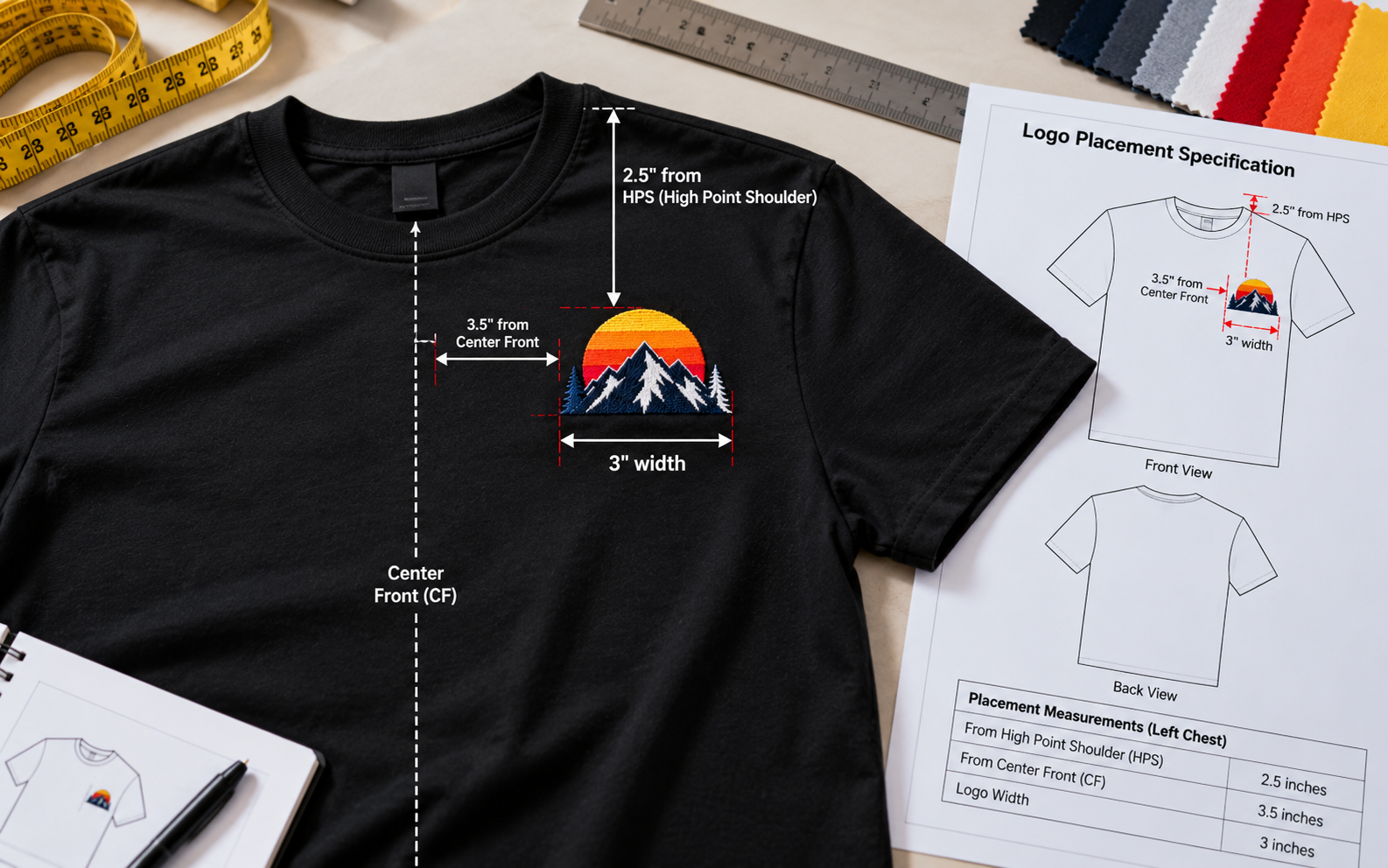
The third common complaint is the logo that sits slightly differently from one garment to the next. It’s rarely carelessness. It usually comes from “centered on the chest” being interpreted by different people in different ways.
The fix is to give a measurement from a fixed point. In apparel the standard reference is the HPS (high point shoulder), the point where the shoulder seam meets the neck. Everything is measured down from there, so it stays consistent across sizes and across a whole run.
[neck]
HPS.——. HPS
/ | \
/ | \
| | |
| Logo top | <- measured DOWN from HPS
| | |
| centre | <- measured from centre front
| front |
A usable placement spec has three parts: the distance down from HPS to the top of the artwork, the distance from the center front (for a left-chest logo), and the artwork’s final width. For example: “Top of logo 4 inches down from HPS, 3 inches left of center front, 3.5 inches wide.” Typical placements vary by garment and size, so confirm the numbers on a sample rather than assuming. Then keep that number in your spec so every run uses it.
An Artwork Checklist
Before you send anything, run through this:
- Logo supplied as a vector (AI, EPS or vector PDF), not a screenshot or website image
- Text converted to outlines, so fonts don’t substitute
- Colors defined by Pantone reference (Solid Coated for ink, TCX for fabric)
- For embroidery, final stitched size was confirmed, and fine detail simplified
- Expectation set that thread is the nearest match from a stock chart
- For sublimation, raster at about 300 DPI at the actual print size
- Placement specified in inches or centimetres from HPS and centre front
- Garment colour noted, since it affects how ink and thread read
- Approved physical or digital proof signed off before production
Frequently Asked Questions
What file format do I need for embroidery?
Embroidery machines run on stitch files, most commonly DST. You don’t usually create one yourself. Send a clean vector logo and the target size, and it’s digitized into a DST for you.
Can embroidery thread match a Pantone color exactly?
Not exactly. The thread can’t be mixed, so it’s selected from a stock chart such as Madeira or Isacord. The result is the nearest available match, which is often very close but not identical.
What is DST conversion?
It’s turning your artwork into a set of machine stitch instructions: stitch type, direction, density, and sewing order. It’s a technical translation of an existing design, not the creation of a new one.
Can you print from a JPEG?
Sometimes, but it’s rarely ideal. A JPEG is a pixel image, so it can look soft or pixelated when enlarged, and screen printing generally needs vector artwork. A high-resolution file at final size works for sublimation, and a low-resolution one usually needs rebuilding first.
How do I specify logo placement?
Measure down from the HPS (high point shoulder) to the top of the artwork, add the distance from centre front, and state the artwork’s final width. Use the same numbers on every order.


